Project Description
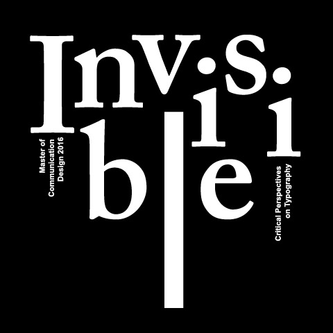
The book is inspired by the article of the Crystal Goblet by Beatrice Warde. He believes the most important thing about printing is to convey thought, ideas and images, from one mind to other minds. Designers who focuses on decoration and ignore the readability are like people who provide golden goblet for tasting wine, even it is valuable people prefer to use a crystal transparent goblet. It reveals an obscure way for visual communication. The good typography supposed to be transparent for readers so they can enjoy the content of the book and not be distracted or disturbed by the decoration. Warde’s idea about crystal goblet is considered as one of the most important graphic design theories. Inspired by Warde’s concept, students of Master of Communication and Design in RMIT express their ideas about book design. For this book design, the idea is to add an extra page filled with letters to chapter opener. Each of the page express one letter’s evolve- ment in the typography history. The letter is Alphabeta order which creates the connection of the articles. Considering the transparent typography, all the elements in the book are designed both functionally and aesthetically. The cover design delivers the idea of ‘Invisible ink’. The letters of ‘ink’ on cover are literally invisible when you take off the book jacket.

